Platform migration
E-commerce platform redesign
to improve the shopping experience.
Project overview
Micron, a global leader in memory manufacturing, offers retail memory and storage solutions through its Crucial brand, helping customers upgrade their devices with ease.
About project
Crucial.com was transitioning its e-commerce platform to Adobe Experience Manager (AEM) from Digital River. This shift aimed to streamline global operations, improve site performance, enhance the user experience, and ensure scalability and consistency in asset management and page structure.
Role
Lead UX Designer
Timeline
9 months
Deliverables
Design System, UX design solutions
Tools used
Figma, Photoshop, Illustrator
Collaboration
UX Manager, Project Manager, SMEs, Development, Commerce partners (Adobe, Digital River)

DISCOVER
UX strategy
My main task was to bring Micron's brand strategy to life across Crucial's U.S. and international commerce sites—from account management and product pages to shopping cart and checkout flows—while elevating the user experience with new features and redesigned tools.
Challenges
It was discovered at the beginning of the commerce platform migration, shifting the code base from both our internal system and Digital River’s to Adobe's React code base introduced usability issues and disrupted workflows. This required rapid, out-of-scope UX solutions to adapt existing experiences to the new platform, necessitating new user flows while ensuring a intuitive and pleasing user experience along with seamless translation of Micron’s brand strategy—all within a tight 9-sprint timeline.
Project goals
Enhance Crucial's shopping experience to embody Micron’s brand identity and messaging, free from usability issues with enhanced features and tools so that users can confidently and easily browse, locate, and purchase products tailored to their systems.
Business need
Strengthen Micron’s brand presence and user experience across all commerce pages to boost brand awareness and site performance to drive sales growth.
STRATEGY
Agile UX for Adobe Commerce Integration

Dual-tracked agile approach
As the sole UX Designer, I was embedded into the platform migration sprint cycle, enabling UX and development to run in parallel. This allowed for rapid UX solutioning, where I conducted research, created wireframes, and validated designs ahead of development tasks—ensuring user needs were continuously addressed as the commerce platform was migrated over to the Adobe platform.
Sprint cycle goals
-
Identify key UX call-outs, leading to either a complete redesign, new design, or minor enhancements.
-
Redesign each page and workflow to align with Micron's 4.0 brand initiative.
-
Ensure all new designs were responsive for optimal performance across all devices.
RESEARCH
Understanding users and industry to establish foundations
Through a deep understanding of users and a thorough competitor analysis, I identified gaps in website and brand experiences, enabling a user-centered design approach that addresses unmet needs for a competitive edge. Below is my research strategy, key insights, and plan for upcoming UX design initiatives.
Competitive analysis
What I learned
Summary
I analyzed competitors to identify gaps in their websites and brand experiences. This allowed me to design with a user-centered focus, creating a competitive edge by addressing what others were missing.
Industry
The demand for DIY RAM and internal SSD upgrades continues to grow in the consumer market. AI and personalized tools are helping consumers make more informed decisions about which RAM and SSD best fit their needs.
User perspective
Consumers want easy-to-install upgrades with clear guidance, prioritizing high-performance and reliability to keep up with advancing tech. With similar prices and performance across RAM and SSDs, companies find it challenging to stand out.
Crucial's direct competitors
Kingston
Corsair
Mission statement
Empowering today's professionals and tomorrow's champions.
Target market
Gamers, content creators, and PC enthusiasts.
Strengths
Offers reliable RAM and SSDs with 2 year warranty.
Modern look with large images
Personalized experiences tailored to different user-types accessed in mega menu.
Filters offer a lot of different options.
Weaknesses
Layout can be overwhelming maybe because not enoug color differentiation, mostly black
Navigation mega menu is a bit overwhelming.
Product listing and category pages have a lot of elements making it difficult to browse the pages.
Can get lost in the information design browsing around the website.
Mission statement
Provide quality products and solutions with unwavering service and support.
Target market
Gamers, tech consumers and PC enthusiasts.
Strengths
Offers reliable RAM and SSDs with lifetime warranty.
Consistent layout throughout.
Clear, simple navigation system to get to the right information.
Content offers helpful information about products.
Weaknesses
Hard to find personalized product/content tailored to user-type.
Filter system a bit confusing on product listing page.
Trust is hard to build for first time users because of lack of reviews.
Hard to understand if can buy products on site or not.
Contextual research
New to the project, I decided to conduct a contextual inquiry at Best Buy, observing shoppers and how sales specialists addressed their needs. This would help me design with customer-focused mindset, ensuring alignment with real-world shopping experiences.
Key objectives
-
What motivates consumers to seek help from sales specialists?
-
Why computer performance is important to consumers?
-
How do consumers shop for different systems?
-
What detractors prevent consumers from making a purchase?
-
Learn what visual aesthetics consumers are drawn to?
Methodologies
Observe and conduct contextual interviews with consumers shopping for computers and gaming devices in-store.
Interview plan
-
Introduce myself to selected and willing participants in store.
-
Explain my role and why I was doing this research.
-
Learn how they are navigating the store.
-
Understand what they thought of the aesthetics.
-
Learn how consumers make purchase decisions.
-
Learn what detractors are keeping them from buying anything.
User interview insights
Non-tech consumer
Steve, father of two children
"Found what I wanted and more!"
*Said this at the cash register to me.
Purchasing for kids, trying to find a present for them.
Overwhelmed by technology but willing to find a new system that fits his family needs.
Information dependent, relying on the sales specialist to help him find what he needs.
Aesthetics has less impact on Steve, he was more interested in understanding more about different gaming systems and what is most popular.
Detractor is lack of information to help him make a decision.
Avid gamer
Michael, teenager
"I come here to check out the latest stuff with my friends."
*Started conversation about Mario game to break ice."
Not purchasing, browsing with friends with no plan to buy anything.
Gaming technology is exciting the latest and greatest even better.
Doesn't need help from sales specialist, already knows what's he likes.
Likes bold, colorful aesthetics 3D artwork and animations. Xbox gravitates too.
Detractor is no money for all the latest greatest technology and games.
Informed gamer
sales specialist
Dan, young adult
"I love to game so working in this department is right up my alley."
*Sparked conversation when I asked about the Meta Quest 3 VR gaming.
Not purchasing, rather selling gaming technology
Loves technology and helping people find what they need when it comes to games and technology.
Likes futuristic aesthetics with minimal design, 3D artwork, a fan of virtual reality.
Detractor is not enough money for all the latest greatest technology, but saves up for products he wants with his employee discount.
Developing a UX strategy from key insights
The insights I captured from this research is what I needed to design experiences for pages, tools, and features to create a seamless and supportive experience, positioning Crucial as a reliable, user-friendly choice in a competitive market.Key findings included:
Industry trends: Design interactive, user-friendly features with AI-driven recommendations.
User priorities: Users value clear navigation, instructions, and reliability, prompting a clean, organized UI with easy access to support.
Personalized tools: Create intuitive, interactive experiences to help guide users, improving usability and decision-making.
Performance highlights: Emphasize performance and reliability with icons, badges, and concise messaging.
EVALUATION
Design audit: Aligning Crucial with Micron brand
I collaborated with the Micron design team and developers to integrate Micron’s brand across Crucial’s commerce and non-commerce pages, maintaining Crucial’s unique identity. This process included aligning brand guidelines, redesigning for accessibility, updating typography, colors, and interactions, and expanding the style guide with new components.
Examples of redesigned elements
New typeface for Crucial
Micron introduced its custom font, Micron Basis, replacing the legacy Barlow font on Crucial’s U.S. and international sites.
Challenge
Micron Basis was wider than Barlow, risking layout disruptions, particularly in languages like German.
Process
Conducted a thorough analysis of replacing Barlow with Micron Basis, ensuring new font and font sizes worked across all sites in all situations and documenting them as I updated the Crucial style guide with new font usage.


PROTOTYPE
Product card design
Product cards are essential for customer satisfaction, conversions, brand perception, and SEO. The redesign refined design with new enhancements and to meet Micron design language optimizing responsiveness, optimizing responsiveness to ensure a seamless experience across all devices.
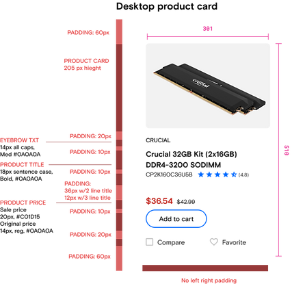

Product card tags
I redesigned product card tags using unique colors from the gradient palette, making it easier for users to quickly distinguish between types of product information and enhancing visual clarity at a glance.

Product catalog pages on desktop
Revamping the Product Catalog page with the Micron brand was key to building an e-commerce platform that draws customers in, meets their needs, and drives action.
Before

After

Responsive product catalog page
Redesigned product cards and catalog pages to be fully responsive across all devices. Through scalable elements, the design adapts seamlessly to desktop, tablet, and mobile, offering users a consistent, high-quality browsing experience. Redesigned filter system to be full screen modal with applied filters at top for user feedback of selections with option to clear all.
Before

After

Enhanced filter selection

Product Details page

Account pages
Redesigned all account pages, covering key areas like address book, payment methods, returns, and order history, shopping cart, checkout flow, and line of credit integration. This overhaul incorporated branding updates to align with company standards, new features, updating user flows and content. Worked in an agile environment, collaborating with cross-functional teams to iterate quickly, ensuring seamless functionality and meeting user needs at every step.
Account sign-in
Chose a center-page modal for sign-in and account creation to keep users on the current page, ensuring a smoother, faster experience. With dynamic loading, this approach enhances performance, boosts engagement, drives conversions, and improves overall satisfaction.
Before single-page account sign-in

After using a modal window for account sign-in

Account management pages
I redesigned all account pages, including address book, payment history, and more, to align with the Micron brand and enhance the user experience.
Key objectives
Improve usability with intuitive interactions that meet accessibility standards, conducting a content audit to update outdated information, and creating new design flows where needed for a seamless transition to the Adobe platform.
Before example of account pages with legacy brand

After example with new brand and enhancements

Checkout experience
I redesigned the new checkout to have the new Micron branding streamlining the experience into a single-page flow with expandable/collapsible blades.
Streamlined Design and User-Centered Enhancements
-
Combine multiple pages into one-page seamless experience to complete checkout.
-
Add iconography to help bring focus to main sections and add aesthetically pleasing elements.
-
Implement Digital River new payment widget to fit new brand and business requirements.
-
Use color to help consumers navigate through the checkout process.
Before

After

RESULTS
Recap of accomplishments
The migrated pages on the Adobe Commerce platform were redesigned with a focus on the customer experience. The new design enhances users' ability to find relevant products quickly. Recap of UX design successes:
-
Refined and implemented the style guide to strengthen brand awareness while preserving Crucial's identity.
-
Enhanced iconography for quicker, more effective navigation.
-
Expanded color usage to reinforce brand presence and emphasize key information.
-
Updated the hero template for full responsiveness, enabling flexible hero design without extra CSS.
-
Modernized commerce pages with Micron branding, new features, and interactions, elevating user experience.
-
Ensured responsive design across all updated pages, optimizing accessibility and usability on the new React code.
Next phase
Post-launch, the team plans to measure the user experience and introduce further enhancements and new features that couldn’t be added during migration. Key features and enhancements I designed throughout the process for future release include:
-
Redesigned line of credit flow.
-
Product compare tool redesign.
-
Redesigned Crucial Upgrade Selector tool and upgrade product results page with a new experience for mobile.
-
New wish list feature to save products for later purchase.
-
Mega menu redesign to bring more transparency to available products and content while boosting SEO.
-
Design system updates that did not make it into the migration efforts.
-
AEM updated components for page designs to match updated brand while meeting accessibility
Site launch
Go team!
The site launched with no major issues. Features and usability enhancements that could not make it into launch I documented in a backlog for the BA to prioritize for enhancements. Overall, there were no complaints from customers and leadership was pleased with the optimized performance and new user experience. A big accomplishment for our team! See it live at crucial.com