MICRON
Commerce redesign
Redesigned commerce pages, ensuring consistent Miconr branding, improved usability, and an enhanced user experience.
ROLE
Lead UX Designer
TIMELINE
9 months
DELIVERABLES
Design System,
UX/UI design solutions
TOOLS USED
Figma, Photoshop, Illustrator
COLLABORATION
UX Manager, Project Manager, SMEs, Development, Commerce partners (Adobe, Digital River)

BACKGROUND
Who is crucial.com
Micron’s consumer e-commerce site, Crucial (crucial.com), offers retail memory and storage solutions that help customers upgrade their devices for better performance and productivity.
Design challenge
Crucial.com was transitioning its e-commerce platform to Adobe Experience Manager (AEM) from Digital River. This shift aimed to streamline global operations, improve site performance, enhance user experience, and ensure scalability and consistency in asset management and page structure.
Branding outdated
Micron updated its brand over a year ago, but Crucial lacked the bandwidth to roll it out across the website
Workflow misalignment
Some workflows had become outdated due to evolving business requirements and shifting priorities.
Conflicting messaging
Content in some cases had not been updated to match newer workflows.
STRATEGY
Industry
The demand for DIY RAM and internal SSD upgrades continues to grow in the consumer market. AI and personalized tools are helping consumers make more informed decisions about which RAM and SSD best fit their needs.
User perspective
Consumers want easy-to-install upgrades with clear guidance, prioritizing high-performance and reliability to keep up with advancing tech. With similar prices and performance across RAM and SSDs, companies find it challenging to stand out.
Research
By leveraging deep user insights and thorough competitor analysis, I identified overlooked gaps in website and brand experiences. My research involved:
-
Primary research - Reviewed available documents, branding, and available research previously done
-
Competitive analysis - Reviewed two main competitors branding and related products
-
Contextual research - Observed shoppers and how sales specialists addressed their needs in the gaming and computer department of Best Buy
Insights
Solution
-
Update Crucial brand - Integrated Micron’s design system into Crucial’s components while preserving brand identity, refining and expanding the style guide with accessible, reusable components.
-
Streamline commerce workflows - Develop clear, branded workflows with logical steps from catalog to checkout, reducing confusion and boosting user confidence.
-
Modernize checkout experience - Design a fast, intuitive single-page checkout process, using color and iconography to guide users, minimizing friction and catering to all user types.
-
Enhance order management - Enable seamless access to invoices, returns, and tracking information, improving efficiency, transparency, and trust in the customer experience.
VISUAL EXPLORATION
Brand audit
Collaborated with the Micron brand team to align Crucial.com with the overarching brand strategy to ensure a cohesive brand experience, reviewing design patterns to develop a strategy for translating them to Crucial.com while ensuring compliance with W3C standards. Utilized research, insights, and Micron's style guide to develop an updated guide that improved communication.

New UI component designs

Website design
As the sole UX designer for the platform migration, I led the prototyping and design of a new commerce experience over nine months, including account pages, shopping cart, and checkout. Working in agile sprints with teams in India, I updated workflows, crafted features, and ensured precise, on-time delivery, enhancing the user journey and driving business outcomes.
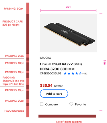
Product catalog page redesign
Redesigning the Product Catalog page for the Micron brand was key to building trust and driving engagement. I revamped product filtering, introduced new product cards, and enhanced responsive design.
Before
After


Before

After

Redesigned filters

Single-page checkout flow
Redesigned the new checkout to have the new Micron branding streamlining the experience into a single-page flow with expandable/collapsible blades with a guided navigation using iconography and color. Integrated Digital River's new payment widget, aligning it with brand requirements and negotiating the addition of missing Terms and Conditions for compliance.
Before

After

Account sign-in
Redesigned account sign-in and account creation pages as modals to keep users on the current page, ensuring a smoother, faster experience. With dynamic loading, this approach enhances performance, boosts engagement, drives conversions, and improves overall satisfaction.
Before


After


Account management page
Redesigned all account pages to align with the Micron brand. Conducted a content audit to update outdated information, enhanced usability, and created new design flows when needed for a seamless transition to the Adobe platform.
Before

After

The site launched with no major issues. Features and usability enhancements that could not make it into launch I documented in a backlog for the BA to prioritize for enhancements. Overall, there were no complaints from customers and leadership was pleased with the optimized performance and new user experience. A big accomplishment for our team!
Results
Accomplishments
The migrated pages on the Adobe Commerce platform were redesigned with a focus on the customer experience. The new design enhances users' ability to find relevant products quickly. Recap of UX design successes:
-
Refined the style guide to enhance brand awareness while preserving Crucial's identity.
-
Improved iconography for efficient navigation.
-
Expanded brand color use to emphasize key information and reinforce branding.
-
Updated the responsive hero template for flexible design.
-
Modernized commerce pages with Micron branding and new features.
-
Ensured responsive design for accessibility and usability on the React code base.